
How to Choose LED Filament Bulb Color Temperature for Commercial Spaces
Practical product, application and sourcing guidance for B2B lighting buyers.
← BACK TO JOURNAL01Choose color temperature by how the space must feel and function
In commercial interiors, LED filament bulb color temperature does more than shape mood. It also affects how guests read materials, how staff work at the counter, and how consistent the brand feels from daylight to evening service. The safest approach is to choose the warmest tone that still supports visibility.
Lower color temperatures tend to flatter wood, leather, brass, and textured plaster, which is why they are common in hospitality-led spaces.
Menus, POS counters, and retail product displays usually need enough visual clarity that lighting feels welcoming rather than muddy.
Use the same family of color temperatures across adjacent areas so transitions do not feel abrupt or visually fragmented.
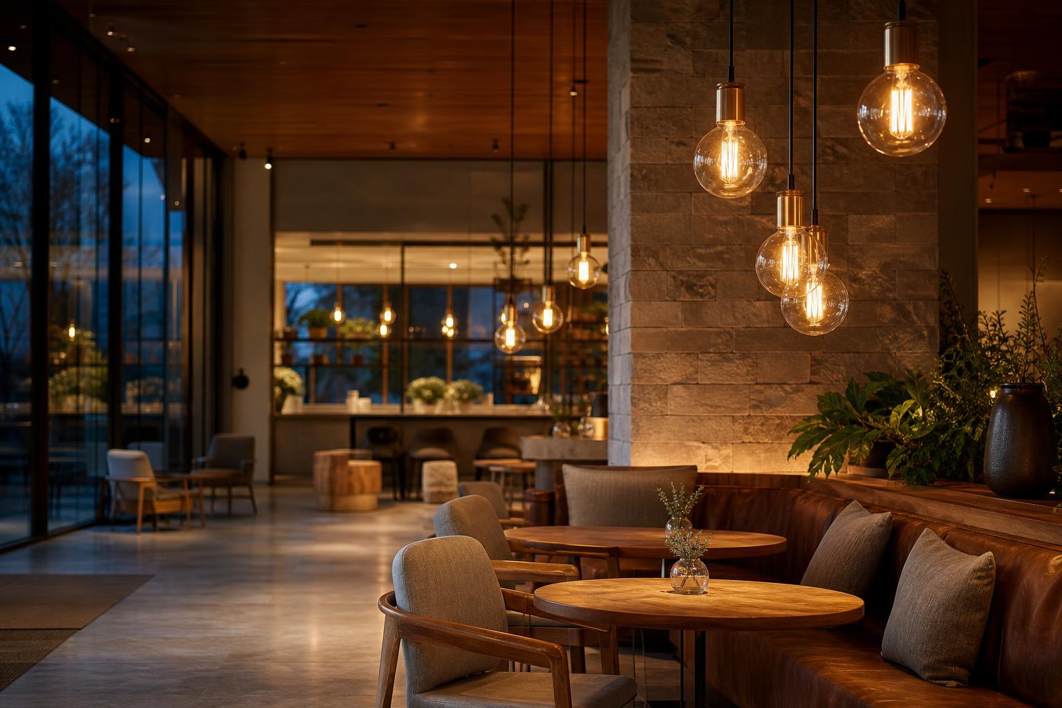
The same filament bulb can feel intimate, neutral, or visually sharper depending on its color temperature. For commercial interiors, the best choice is rarely about “warmest” or “brightest” alone — it is about whether the space needs welcome, clarity, or a balanced in-between.
Warm white for hospitality-first zones
Use warmer tones when the priority is comfort, pause, and brand warmth. Cafés, lounges, bars, and reception areas usually benefit from a softer glow that makes seating feel relaxed and layered.
Neutral white for mixed-use visibility
When customers still need to browse, read menus, or move confidently, a neutral tone often keeps the atmosphere calm without making the room feel too amber or too dim.
Cooler tones for task-led moments
Sharper color temperatures can support circulation, back-of-house visibility, and product-focused displays where definition matters more than mood.
Let material and finish do part of the work
Glass type, fixture shielding, ceiling height, and surrounding finishes all change how a filament bulb reads in the room. A tone that feels perfect in one venue can look too warm or too flat in another.
Practical rule
Start with the emotional role of the space, then verify the visual job: lingering, browsing, or moving through. That order keeps the lighting choice aligned with real commercial use instead of personal preference alone.
For a simple project workflow, compare the room’s main activity against the desired brand tone, then select the color temperature that supports both.
Next, use the example spaces on the right to translate that logic into café, lobby, retail, and corridor decisions.
Best when the goal is comfort, dwell time, and a more relaxed brand impression.
Retail displayKeep enough clarityUse a tone that still shows product detail and shelf organization clearly.
Hotel lobbyBalance welcome and legibilityA middle ground usually feels refined while supporting check-in and wayfinding.
CorridorPrioritize safe movementA cleaner tone can help transitions feel clear and intentional.
For commercial interiors, the best filament bulb is rarely the warmest or the brightest by default. Start with what the space must do, then let color temperature support that job. A calm hospitality mood, a clear circulation route, and a merchandise-focused display can all call for different tones.
Use the checklist below as a procurement shortcut: it helps designers, buyers, and contractors agree on a starting point before sample testing.
In practice, the right choice is usually the one that preserves comfort, keeps surfaces readable, and still matches the brand’s visual tone after dark.
Define the space function
Ask whether the room is for lingering, moving, reading, selling, or transitioning. Dining and lounge areas usually tolerate a warmer feel, while task-heavy or wayfinding areas often need a cleaner, more neutral tone.
Review surface colors
Warm woods, brass, and deep textiles can absorb some of the warmth of a bulb. Pale stone, white walls, and reflective finishes can make the same lamp look brighter and cooler, so test against actual finishes.
Set the brand mood
If the brand promise is intimate and relaxed, a softer tone usually helps. If the environment needs a crisp, contemporary feel, move slightly toward neutral without making the space feel sterile.
Check task visibility
Read menus, labels, artwork, or product details under the bulb before you commit. The right color temperature should help people see clearly without flattening texture or making skin tones look harsh.
Test at night
Always review a sample installation after dark and with the full lighting mix on. Compare the bulb against nearby fixtures, wall finishes, and signage before freezing the spec.
When in doubt, create a small mockup and evaluate it in the real space. A one-hour test can prevent a costly mismatch across the whole project.
Request quote02Buyer Questions
Choose color temperature by matching mood, visibility, and brand consistency to the space’s main job.
What is the safest starting point when choosing LED filament bulb color temperature?
Start with the space’s main job and choose the warmest tone that still supports visibility. The article recommends deciding whether the room is for lingering, reading, selling, or moving through, then matching the color temperature to that function so the lighting feels coherent and practical.
When should warm white filament bulbs be used in commercial interiors?
Warm white is best when comfort, pause, and brand warmth matter most. Cafés, lounges, bars, reception areas, and dining spaces usually benefit from a softer glow, and warmer tones flatter wood, leather, brass, and textured plaster. Use caution if the space also needs very crisp menu or merchandise reading.
When is neutral white the best choice for a project?
Neutral white is often the safest middle ground for mixed-use commercial spaces. It works well in lobbies, corridors, and reception desks because it keeps the atmosphere calm while preserving readability for browsing, wayfinding, and longer dwell times without making the room feel too amber or too cold.
Where do cooler white filament bulbs make sense?
Cooler white works best in retail display, work zones, and back-of-house areas where details need sharper separation. It can support product reading, signage clarity, and task visibility, but if it is used too broadly in hospitality settings, the room can feel less inviting.
How should a buyer test the final color temperature before approval?
Test the sample in the real space after dark with the full lighting mix on. Compare it against nearby fixtures, wall finishes, ceiling height, and signage, then review how it reads at opening, during peak occupancy, and in the evening. A small mockup can prevent a costly mismatch.
Close the loop with a sample-first decision
03Request samples, confirm specs, then finalize the lighting mix
For commercial interiors, the safest way to choose LED filament bulb color temperature is to test the lamp in the real room, against the actual materials, furniture, and daylight conditions. A warm tone can soften hospitality spaces, while a more neutral tone may support retail clarity or task visibility. The right answer is the one that preserves brand atmosphere without making the space feel dim, flat, or overly cold.
Use the sample stage to compare how the bulb reads at opening, during peak occupancy, and after sunset. Check how the filament glow looks in the fixture, how surfaces reflect, and whether the overall mood still fits the project brief. If the room has mixed uses, confirm whether one temperature can serve both comfort and visibility, or whether the design needs a layered approach.
Next step
Request samples, align the color temperature with the project spec, and confirm the final selection before placing a larger order.
- Compare warm, neutral, and cooler options in the installed setting
- Verify the bulb reads well with the fixture finish and material palette
- Confirm the final choice with procurement, design, and site teams
Looking for a Product, Not Just Information?
Explore AromaLight LED filament bulb models or send us your specifications, reference photos and OEM / ODM requirements.